Improve List View
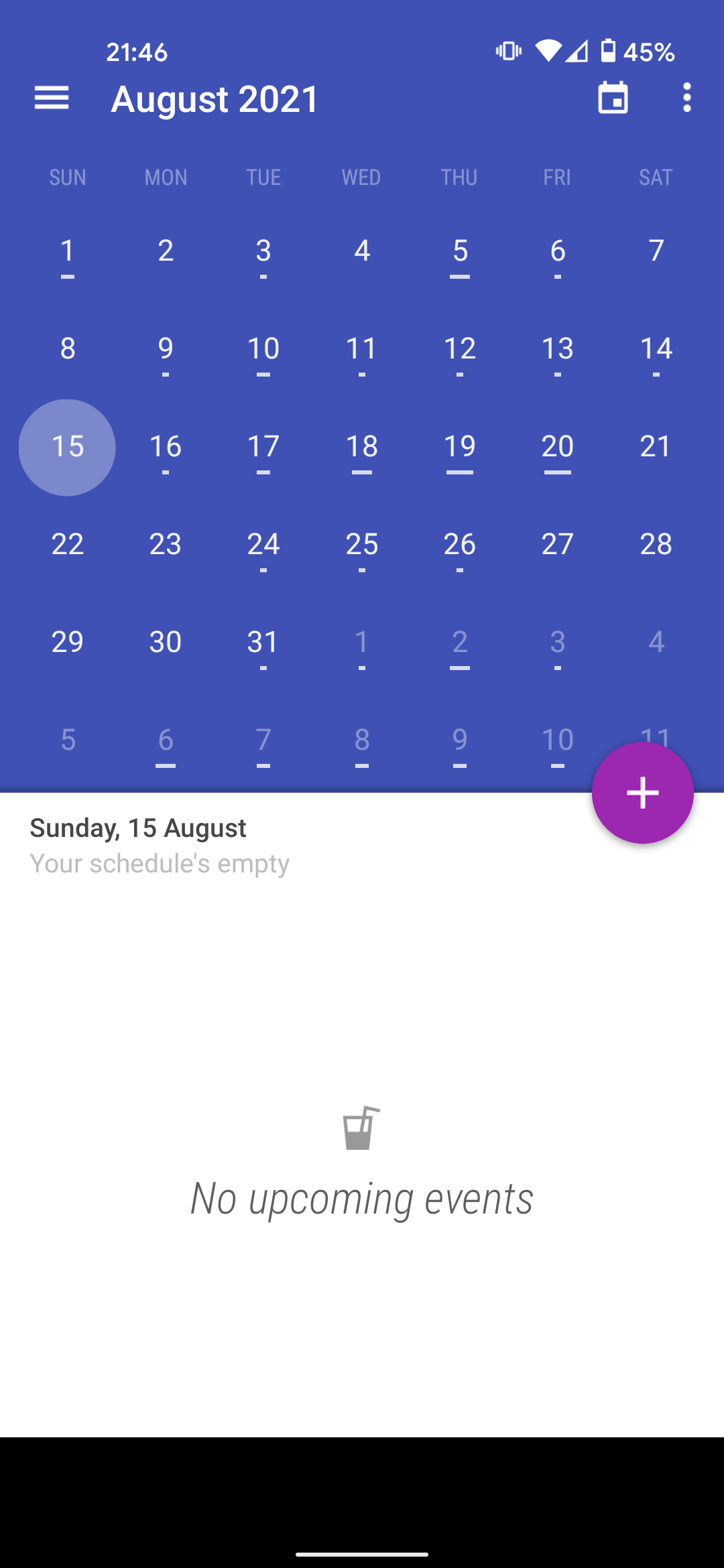
I prefer to use the list view, but it's hard to look at and messes with my eyes. It would be easier to look at if the month calendar at the top of the screen was bigger and more spread out, maybe taking up the top third or more of the screen. If you look at the standard calendars on Samsung or iPhones, the formats are easier to look at and the month calendar on top takes up the whole top of the screen, not just a bunch of numbers squished together in a small space.
