40

Calendar layout options like Win 10

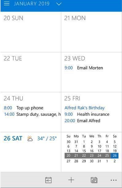
Provide layout options similar to Windows 10 Mobile showing weekly calendar in squares for each day expanded for details of selected date (see attached screen shots). 
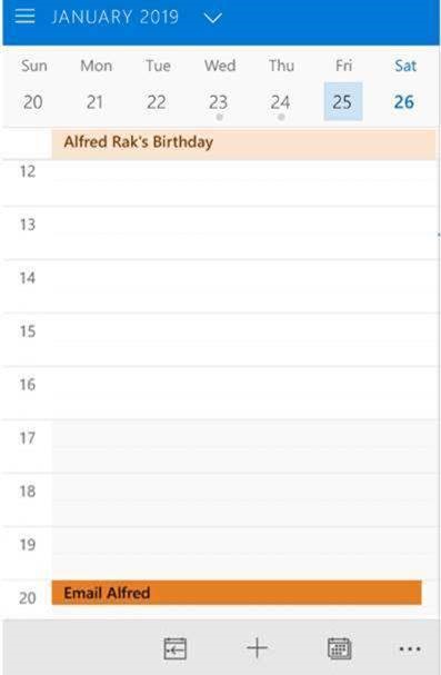
Have day calendar view with showing selectable number of hours which can be scrolled up or down and with all day events fixed at the top (see attached screen shot). 
4 replies

N

On my side (with an old Samsung Galaxy S7 with medium Size settings) => Day view is displayed from 6 to 22... which perfectly fits my needs.

Your display is not linked to the app version (you're running a recent version 😉) but rather to screen resolution I think.

Can a more tech guy can have a look and give us an answer to this "repetitive" question of "nb of hours displayed in app"?

Thanks to you all,

WR

Thanks for the update, which doesn't help. When I select large day view I see from 7 - 19 while on both medium and small I see 7 - 23 (don't know why both are the same; I have version 3.3.0). When I sent my original screen shot over 2 years ago, my day view was from 12 - 20.

N

All these layout issues are now fixed in the Android app.

The only one remaining is linked to number of hours displayed in day and week views (see https://support.onecalendar.nl/i62-please-add-zoom-and-ability-to-control-how-many-hours-are-viewed)

=> I think we can close now this "ticket" created 2 years ago 🙂.

M

Address issue of font size and viability by having option to see daily and weekly views by making better use of screen space which also enhance ease of use. The current layout is very restricted which makes it more inconvenient to use. Streamling the arrangement would help to have easy overview of both daily and weekly agendas.